Emotional Journey TTC
Reimagining the daily commute as an emotional timeline.
Role
UX/UI Design
Timeline
2 Weeks
Tools
Illustrator, PS
Context
Academic Project
The Context
The Challenge
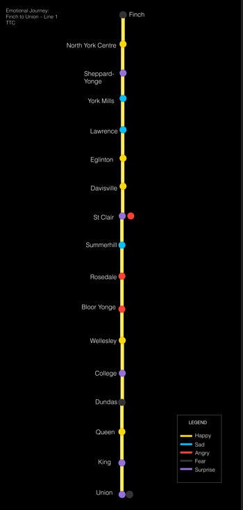
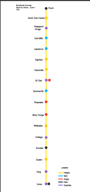
Traditional transit maps show routes but not emotional experience. They prioritize logic over the human reality of a commute. The challenge was to interpret a public system through a human, emotional lens.
The Solution
Using a Vignelli-inspired colour system, each TTC station becomes an emotion. The final visual reads like an emotional map of the rider’s inner journey from Finch to Union.
"Mapping the invisible weight and lightness of a daily routine."
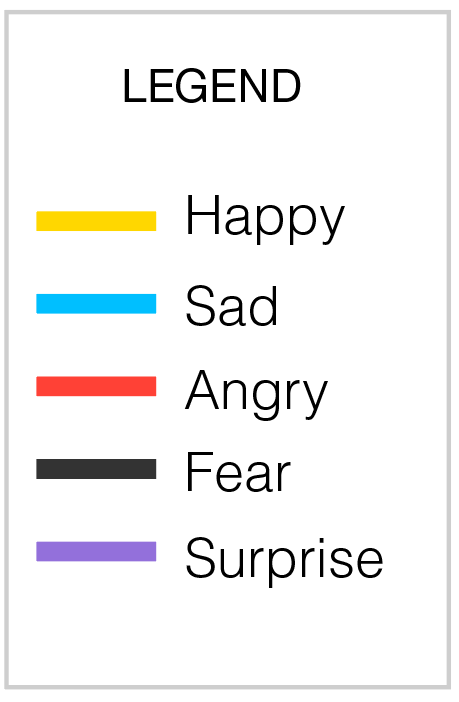
Emotional Colour Framework
I established a colour code to represent feeling states:
- Yellow — Relief / Lightness
- Blue — Heaviness / Sadness
- Red — Anger / Overwhelm
- Purple — Surprise / Awakening
Reflection
Guided by Professor Chris, whose systems-thinking approach shaped the emotional pacing and narrative clarity of this project. It taught me to look for the invisible layers of data in everyday life.
Project Credits
Design & Visuals: Michelle Miyata