Discover BC
Calm, photography-led travel booking designed for cognitive ease.
Role
UX/UI Design
Timeline
3 Weeks
Tools
Figma, Illustrator
Context
Course Project
The Context
The Challenge
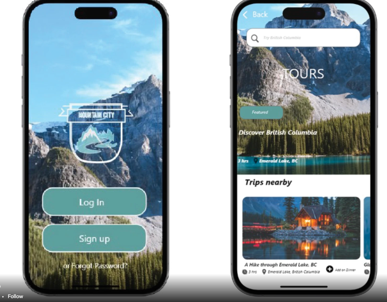
Many travel apps create cognitive overload with dense UI, multiple competing actions, and overwhelming information. The challenge was to design a travel experience that feels calm, emotionally grounding, and intuitive for first-time or anxious travelers.
The Solution
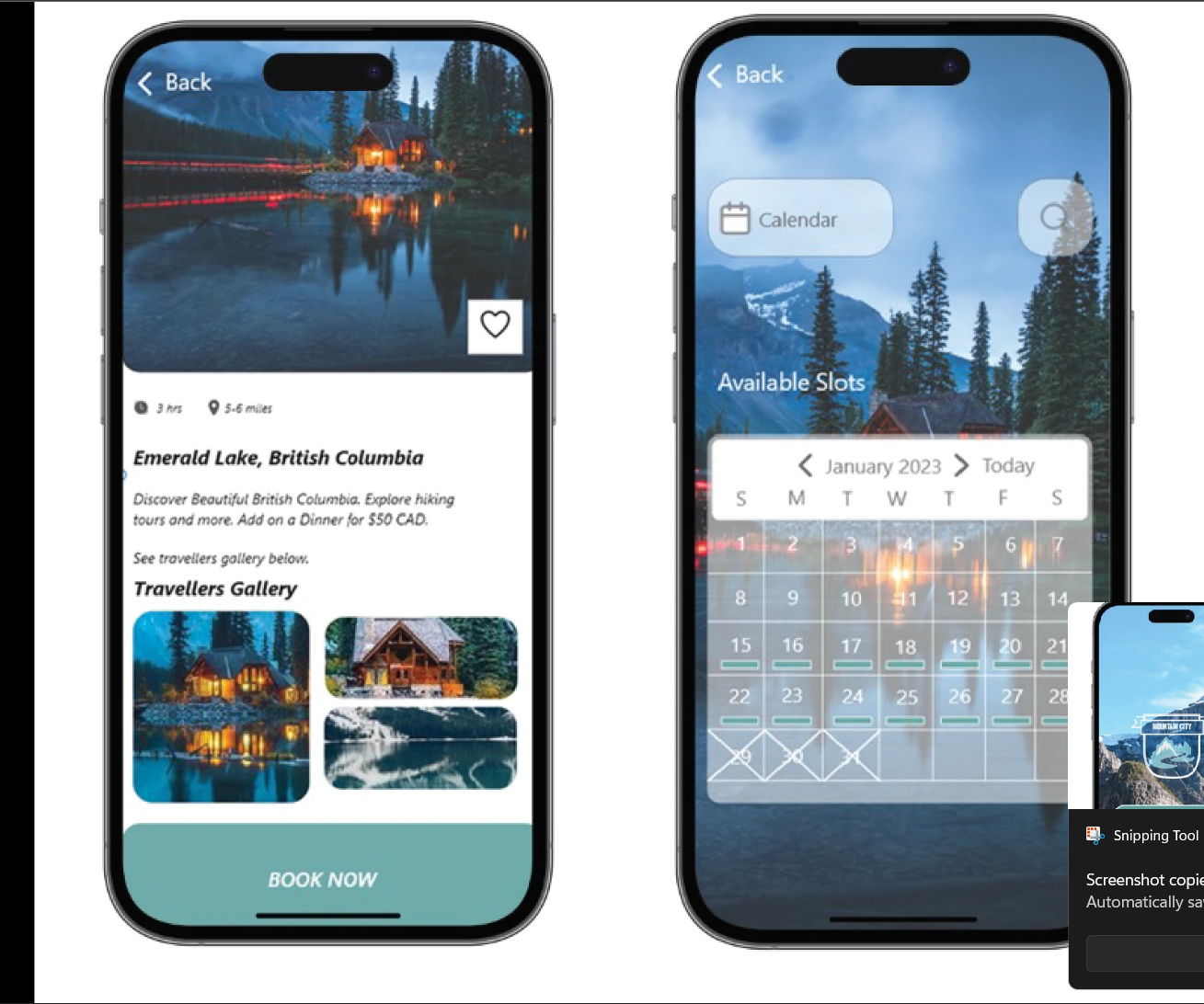
Discover BC centers around minimal UI, clean spacing, and emotional clarity. The design uses soft visual hierarchy and large photographic anchors to help users make decisions at their own pace without feeling overwhelmed.
"Designing for the calm discovery of new places, not the stress of booking them."

Reduced Cognitive Load
Early wireframes focused on reducing clutter. By using generous whitespace and limiting the number of calls-to-action per screen, the interface invites exploration rather than demanding attention.
Reflection
Special thanks to Professor Jennifer for guidance on structuring calm visual experiences. This project highlighted how spacing and pacing can directly influence a user's stress levels and decision-making confidence.
Project Credits
Design & Visuals: Michelle Miyata
Photography from Unsplash/Pexels.